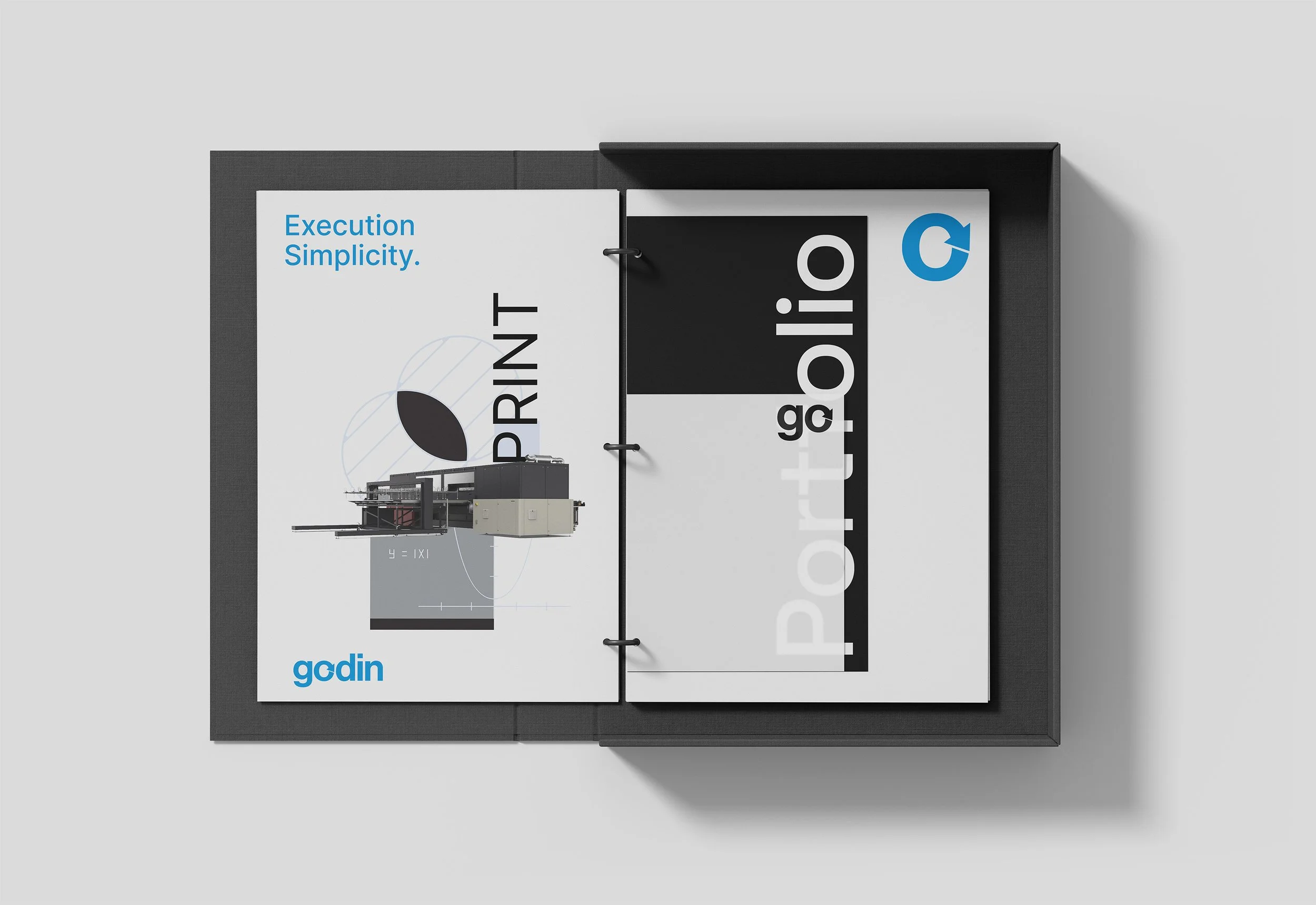
Godin Rebrand
30 years ago Godin was a small printing broker with one client. Today, it's a Toronto based production powerhouse working with leading CPG companies and brands. However, the Godin brand itself was left behind, never being addressed in the companies 33 years.
After interviewing key stakeholders it became clear that although Godin was a full service provider of creative, print and distribution, convincing clients to use the full-scope of their offerings was challenging. I was tasked to update the brand with a new position that would reconcile all of their departments – design, structural engineering, print, production, warehousing and fulfillment – under one roof. A one-stop shop for their clients needs.
My strategy was to emphasize Godin’s capabilities through a new wordmark and mnemonic that focuses on the word ‘go’, with a circular arrow alluding to the completeness of their end-to-end solutions. The primary reason for choosing green is to evoke feelings of growth, change and safety. Green is also the best identifier for the word 'go' with its ubiquity in transportation signals. To meet WCAG 2 level AA accessibility standards, Spring green works in conjunction with MIdnight Cyan and Jade green with White.
A two colour and one colour logo were developed. The two colour logo is the primary logo and should be used when the logo stands alone. The one colour logo should only be used in conjunction with the tagline, whereby the tagline takes on the secondary colour. This keeps communication at the forefront and prevents the wordmark from competing with the tagline.
*This project is currently ongoing and will be updated once complete.